Good and Bad Design
2D Design
Discussion Questions from Readings:
-
How can synaesthetics be incorporated effectively in design? In order to convey meaning, does an artist have to appeal to a viewer's pre-established understanding of symbols?
-
How are new symbols introduced into the "language" of synaesthetics?
-
How can an artist mindfully incorporate the elements of good design in their work? Does one just need the 'eye' for good design, or can the elements be strategically added?
Good Design:
Bad Design:

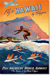
This design is an illustration by Mark von Arenburg for a Pan American Airlines advertisement. The poster incorporates various design elements that make it interesting and eye-catching.
First, the artist uses grouping by arranging the fish, surfers, and landscape into their own distinct areas of the piece. Additionally, the airplane (which ultimately is the subject of the illustration) has its own section at the top of the frame to add emphasis onto it.
Von Arenburg uses continuity in that each object interacts with the others. For example, the fish touch the water, the water touches the surfers, and the airplane touches the sky. This creates fluent transitions between the distinct groups and results in a cohesive image.
Movement is also central to the illustration. The fish, surfers, line of mountain, and airplane all head to the left. This implies that the adventure of Hawaii is attainable by moving to the left; namely, on a Pan American airplane.
Finally, scale is used in the illustration to once again emphasize the airplane. The artist makes the airplane disproportionately large and thereby makes it the central feature of the advertisement.
The logo of the Trail Blazers, Portland's professional men's basketball team, is an example of a bad design.
The design is visually confusing in its use of lines. The spiral's arms are meant to represent the 10 basketball players on the court, but their radial symmetry to the center of the pinwheel makes this confusing. Additionally, the taper at the end of each line implies outward movement, which suggests the 'players are all being blown out from the center of the logo. A better design would change the movement of the lines to more accurately portray the action of playing basketball.
Next, this design lacks in continuity. There is no connection between the various elements of the design; the pinwheel, border, and text all seem to be arbitrarily placed. A better design would more consciously group these elements and incorporate the team name more cohesively into the logo.

